Just over a year after helping our client, ChristianaCare, rebrand their historic organization, they have been ranked as the health system with the #1 Most Improved Brand Perception in the nation in an article by Becker’s Hospital Review based on a joint study by Monigle, American Hospital Association (AHA) and the Society for Health Care Strategy and Market Development (SHSMD).
Rebranding With Love
Love. It’s not a word typically associated with health care. Yet, when Wax was asked to rebrand ChristianaCare, one of the leading health systems in the country and the largest in Delaware, love was at the forefront of this endeavor. When paired with excellence, these reflect their core values and deeply held belief that health care should be a partnership in which each party feels loved and respected.
For a period of time after a rebrand, it can be difficult to measure its effectiveness beyond the surface level. After a recent survey of 30,000 people conducted by Monigle in collaboration with the American Hospital Association and the Society for Health Care Strategy and Market Development, the results have shown our strategy to be a resounding success.
ChristianaCare’s brand perception was named the #1 most improved from 2020 to 2021 among 200 healthcare organizations. During a volatile year that presented huge challenges for everyone, especially within health care, ChristianaCare stood as a source of hope and optimism.
An additional analysis of brand strength, conducted by market research firm Chadwick Martin Bailey, showed an increase in total brand awareness to 94% in the primary service area, a staggering lead above the subsequent competitors standing at 66%.
In the same study, regarding the consideration rate (respondents’ decision to choose one brand vs. others), ChristianaCare also led the results at 52% more likely. The next competitor followed behind at 33%. All respondents had prior awareness of all healthcare organizations included in the survey.
How We Did It
Our journey to rebrand this well-established organization was built on a foundation of research that informed both messaging and new graphic design elements. We analyzed big data from Nielsen, Scarborough, Facebook, Google and others, as well as internal data from Press Ganey and strategic planning.
Most importantly, we conducted our own proprietary research to gather insight about brand equity, preference and awareness. This included focus groups, man-on-the-street interviews, online and phone surveys, and private discussions with hospital leadership, physicians, nurses, volunteers, patients and leaders of the organization.
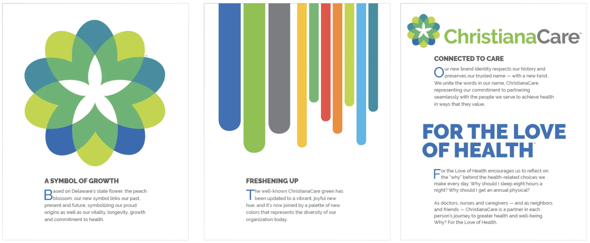
After months of creative and strategic planning, a beautiful, new brand formed. A refreshed visual identity and language that fosters a strong, emotional connection between ChristianaCare and the community they serve.

The dated dark green evolved into a vibrant palette of bold blue and lighter, more vivid green backed by a brilliant secondary color set. We replaced the previous logo symbol with a modern, abstracted symbol inspired by the peach blossom – Delaware’s state flower. We streamlined the name into one word, ChristianaCare, respecting the organization’s storied legacy but also its commitment to partnering seamlessly with patients and the community.
When developing the message, both the organization and our team recognized the importance of building a stronger human connection with healthcare providers based on empathy and sincerity, and the desire to feel valued. Under the inspiring leadership of President and CEO Janice E. Nevin, MD, MPH, and her talented team all the way down to the courageous frontline workers, two words guided every thought and action by more than 13,000 employees: Excellence and Love.
We used these simple but profound values as the springboard to create our messaging. A teaser campaign led up to the official reveal – a multichannel effort consisting of unbranded ads with questions like “Why run that 5K?” and “Why get a flu shot”? The launch campaign revealed the new logo, symbol and name, plus the answer to the teaser questions. Why make these health-conscious choices? FOR THE LOVE OF HEALTH, which became the theme for the launch of the new brand and the efforts that followed.

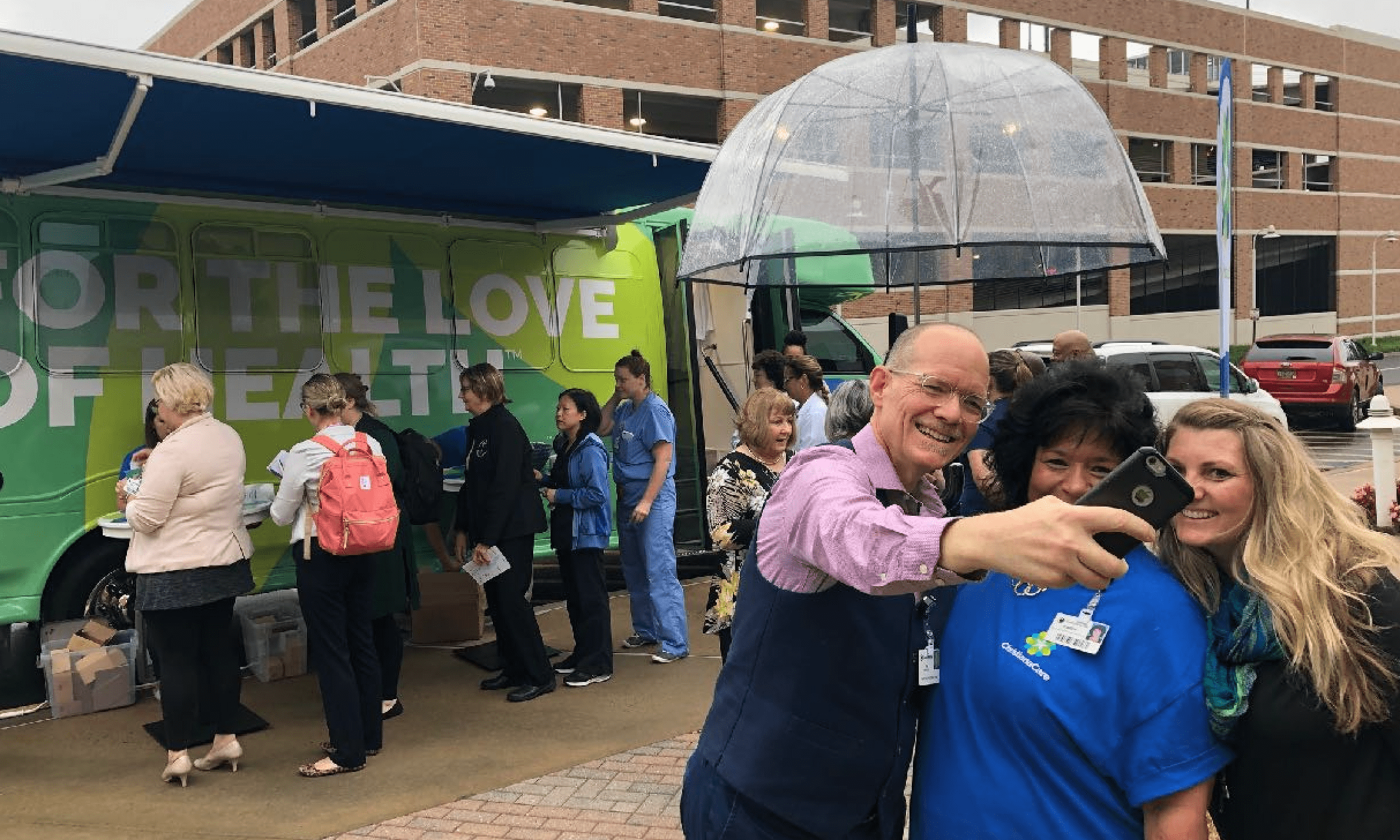
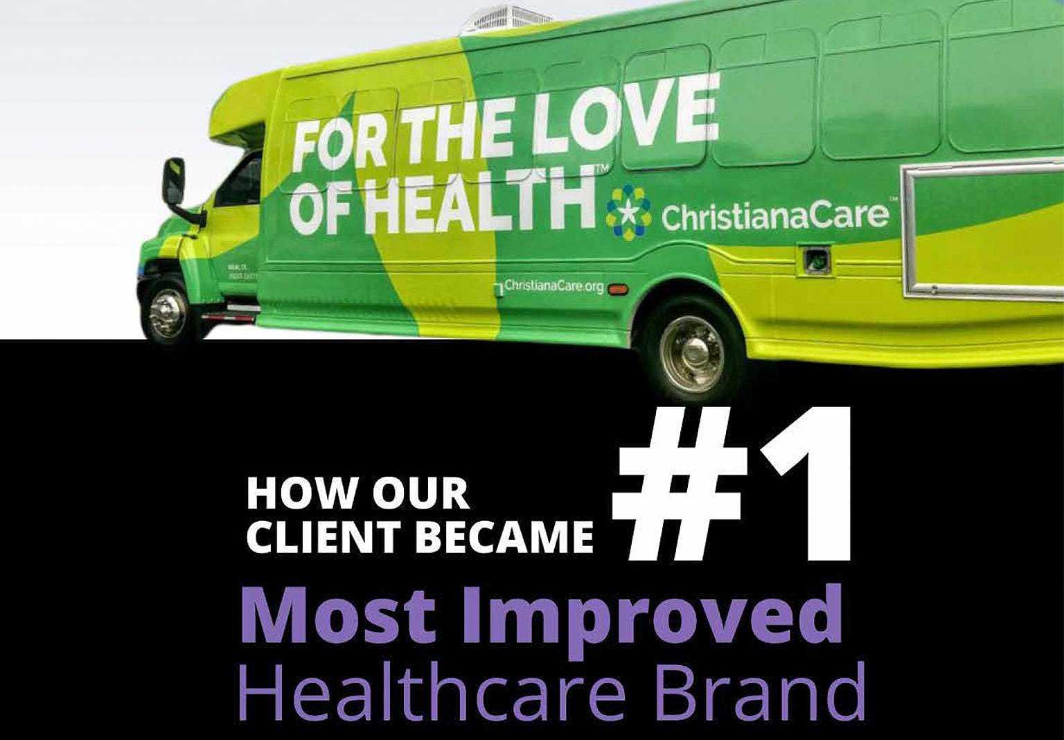
On the day of the public unveiling, we held an exciting event for caregivers that included a bus wrapped in the graphics and converted inside into an immersive brand experience. Most importantly, this new brand has reinvigorated the organization, inspired staff and positioned ChristianaCare for growth and success for many years to come.

Since the launch, the brand bus is still touring the community, spreading the love. And Wax continues to enhance ChristianaCare’s brand with new artistic executions of its promise to the people it serves.


